Samuel Treindl
Client: Samuel Treindl
Year: 2016 – ongoing
Medium: posters, website, book
→ samuel-treindl.de → brandhaus.de
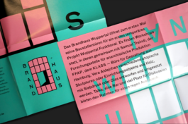
The artist Samuel Treindl initiated the renovation of a burnt-down factory building in Wuppertal’s city centre to create new space for workshops, talks and temporary art projects. The Brandhaus Wuppertal becomes a place of social exchange for cultural workers, architects, artists and local residents.
The artist Samuel Treindl initiated the renovation of a burnt-down factory building in Wuppertal’s city centre to create new space for workshops, talks and temporary art projects. The Brandhaus Wuppertal becomes a place of social exchange for cultural workers, architects, artists and local residents.
The artist Samuel Treindl has a lot of output and a colorful, overlapping and accumulating style. His website has to reflect this visually and show the essence of his work. At the same time, the site should be practical and easy to use.
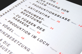
That's why the basic idea of the homepage is a written-out menu. A series of words describe his work, form project groups and structure the vast content.
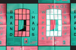
We developed a strong visual identity in green, black and pink, the colors most commonly used at Samuels Art. The typical shape of the factory window becomes the logo and the grid around which the typography can wrap. An open window in the middle of the logo to represent the open character of the fire house.
We developed a strong visual identity in green, black and pink, the colors most commonly used at Samuels Art. The typical shape of the factory window becomes the logo and the grid around which the typography can wrap. An open window in the middle of the logo to represent the open character of the fire house.
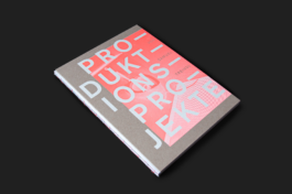
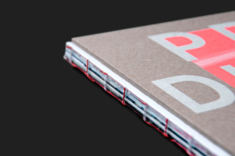
The artist book ‘Produktionsprojekte’ was designed in intensive dialogue with the artist. It represents the artist’s works, but also his experimental working method through the page layout, the dynamic arrangement of the images and the repetitive use of typography. The catalogue also contains its own typo-/graphic interpretations of Samuel Treindl’s working method. Due to the elaborate printing and binding technique, the catalogue itself becomes a ‘production project’.
The artist book ‘Produktionsprojekte’ was designed in intensive dialogue with the artist. It represents the artist’s works, but also his experimental working method through the page layout, the dynamic arrangement of the images and the repetitive use of typography. The catalogue also contains its own typo-/graphic interpretations of Samuel Treindl’s working method. Due to the elaborate printing and binding technique, the catalogue itself becomes a ‘production project’.
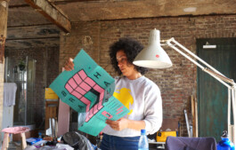
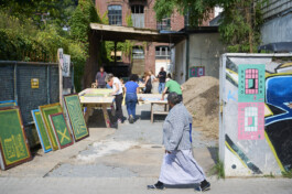
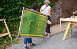
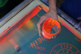
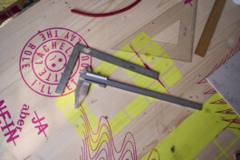
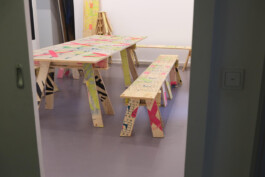
We were invited to the inauguration to print wooden panels within a screen printing workshop, which became the furniture of the Brandhaus.
We were invited to the inauguration to print wooden panels within a screen printing workshop, which became the furniture of the Brandhaus.
We were invited to the inauguration to print wooden panels within a screen printing workshop, which became the furniture of the Brandhaus.
We were invited to the inauguration to print wooden panels within a screen printing workshop, which became the furniture of the Brandhaus.
We were invited to the inauguration to print wooden panels within a screen printing workshop, which became the furniture of the Brandhaus.
Samuel Treindl
Client: Samuel Treindl
Year: 2016 – ongoing
Medium: posters, website, book
→ samuel-treindl.de → brandhaus.de
The artist book ‘Produktionsprojekte’ was designed in intensive dialogue with the artist. It represents the artist’s works, but also his experimental working method through the page layout, the dynamic arrangement of the images and the repetitive use of typography. The catalogue also contains its own typo-/graphic interpretations of Samuel Treindl’s working method. Due to the elaborate printing and binding technique, the catalogue itself becomes a ‘production project’.
The artist book ‘Produktionsprojekte’ was designed in intensive dialogue with the artist. It represents the artist’s works, but also his experimental working method through the page layout, the dynamic arrangement of the images and the repetitive use of typography. The catalogue also contains its own typo-/graphic interpretations of Samuel Treindl’s working method. Due to the elaborate printing and binding technique, the catalogue itself becomes a ‘production project’.
The artist Samuel Treindl has a lot of output and a colorful, overlapping and accumulating style. His website has to reflect this visually and show the essence of his work. At the same time, the site should be practical and easy to use.
That's why the basic idea of the homepage is a written-out menu. A series of words describe his work, form project groups and structure the vast content.
The artist Samuel Treindl initiated the renovation of a burnt-down factory building in Wuppertal’s city centre to create new space for workshops, talks and temporary art projects. The Brandhaus Wuppertal becomes a place of social exchange for cultural workers, architects, artists and local residents.
The artist Samuel Treindl initiated the renovation of a burnt-down factory building in Wuppertal’s city centre to create new space for workshops, talks and temporary art projects. The Brandhaus Wuppertal becomes a place of social exchange for cultural workers, architects, artists and local residents.
We developed a strong visual identity in green, black and pink, the colors most commonly used at Samuels Art. The typical shape of the factory window becomes the logo and the grid around which the typography can wrap. An open window in the middle of the logo to represent the open character of the fire house.
We developed a strong visual identity in green, black and pink, the colors most commonly used at Samuels Art. The typical shape of the factory window becomes the logo and the grid around which the typography can wrap. An open window in the middle of the logo to represent the open character of the fire house.
We were invited to the inauguration to print wooden panels within a screen printing workshop, which became the furniture of the Brandhaus.
We were invited to the inauguration to print wooden panels within a screen printing workshop, which became the furniture of the Brandhaus.
We were invited to the inauguration to print wooden panels within a screen printing workshop, which became the furniture of the Brandhaus.
We were invited to the inauguration to print wooden panels within a screen printing workshop, which became the furniture of the Brandhaus.
We were invited to the inauguration to print wooden panels within a screen printing workshop, which became the furniture of the Brandhaus.