
Vereinigte Bühnen Bozen
Client: Vereinigte Bühnen Bozen, Rudolf Frey
Year: 2023 — ongoing
Media: CI, website, posters, flyers, magazine, business cards, signage
Typeface: Good Sans, Chapter
→ theater-bozen.it
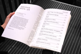
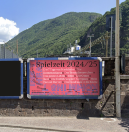
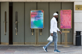
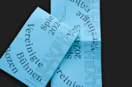
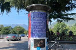
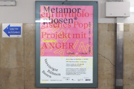
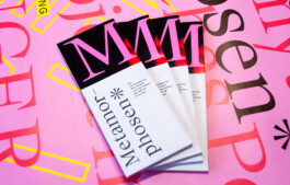
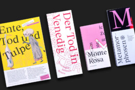
Spielzeit 24/25
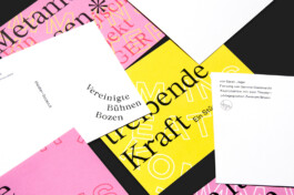
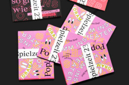
Starting with season 23/24 and a complete redesign of the CI, the goal of the design of season 24/25 was an adaptation and a new idea with new geometric shapes, new slogan and new colors. The idea should fit in with the old design but still bring new elements. Not being as pop as the last season, the colors and shapes fit the themes, which are more dramatic and serious than in the previous season.
Spielzeit 24/25
Starting with season 23/24 and a complete redesign of the CI, the goal of the design of season 24/25 was an adaptation and a new idea with new geometric shapes, new slogan and new colors. The idea should fit in with the old design but still bring new elements. Not being as pop as the last season, the colors and shapes fit the themes, which are more dramatic and serious than in the previous season.
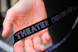
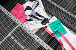
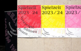
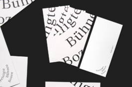
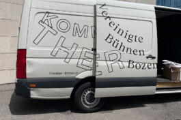
Spielzeit 23/24
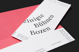
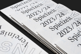
For the Vereinigte Bühnen Bozen and its new artistic direction, we developed redesign. The core concept behind the new appearance is a typographic, welcoming gesture into the theater „KOMM INS THEATER!“. The design is nearly entirely typographic, which highlights the emphasis on language and spoken theater. It is bold, wild, and friendly with a strong cultural connection. Using a flexible, moving Logo that takes inspiration from the rows of seats in a traditional amphitheater, Vereinigte Bühnen Bozen always takes up the space it needs on the different product formats.
Spielzeit 23/24
For the Vereinigte Bühnen Bozen and its new artistic direction, we developed redesign. The core concept behind the new appearance is a typographic, welcoming gesture into the theater „KOMM INS THEATER!“. The design is nearly entirely typographic, which highlights the emphasis on language and spoken theater. It is bold, wild, and friendly with a strong cultural connection. Using a flexible, moving Logo that takes inspiration from the rows of seats in a traditional amphitheater, Vereinigte Bühnen Bozen always takes up the space it needs on the different product formats.
Vereinigte Bühnen Bozen
Client: Vereinigte Bühnen Bozen, Rudolf Frey
Year: 2023 — ongoing
Media: CI, website, posters, flyers, magazine, business cards, signage
Typeface: Good Sans, Chapter
→ theater-bozen.it
Spielzeit 24/25
Starting with season 23/24 and a complete redesign of the CI, the goal of the design of season 24/25 was an adaptation and a new idea with new geometric shapes, new slogan and new colors. The idea should fit in with the old design but still bring new elements. Not being as pop as the last season, the colors and shapes fit the themes, which are more dramatic and serious than in the previous season.
Spielzeit 23/24
For the Vereinigte Bühnen Bozen and its new artistic direction, we developed redesign. The core concept behind the new appearance is a typographic, welcoming gesture into the theater „KOMM INS THEATER!“. The design is nearly entirely typographic, which highlights the emphasis on language and spoken theater. It is bold, wild, and friendly with a strong cultural connection. Using a flexible, moving Logo that takes inspiration from the rows of seats in a traditional amphitheater, Vereinigte Bühnen Bozen always takes up the space it needs on the different product formats.